Study Edge Migration

Click here to visit Study Edge Website

Role

UX / UI Designer

Tools

Figma, Thinkific, Adobe Express

Duration

3 Months

Brief

StudyEdge is a subscription-based learning portal for University of Florida students that utilizes legacy technology.

Study Edge is a platform that complements students’ learning by providing access to  in-person and online chapter reviews, in-person and online exam reviews, study experts, mock exams, a class wall, and dedicated study hours.

My Contribution

As the UX/UI Designer, I guided the project’s design direction, ensuring that every decision aligned with both user needs and business objectives. I created wireframes, developed the design style, and additionally implemented these design decisions directly on the Thinkific platform, making sure the final experience was both functional and visually cohesive.

Problem

Study Edge’s platform limits student experience, allows password sharing, and is hard to scale to new universities. The migration aims to enhance usability, secure revenue, and enable expansion.

The current platform limits the user experience for students, lacks scalability for expansion to new universities, and allows unauthorized access through password sharing. These issues hinder revenue growth, increase maintenance and support efforts, and reduce the overall value of the platform.

Target Users

Students from the University of Florida—and eventually other universities—use the platform to access study materials easily. The design focuses on strengthening students’ learning through an intuitive, efficient experience that supports academic success.

Goal

To modernize the student experience through UI/UX updates, while increasing revenue via account security, tiered pricing, all supported by streamlined backend operations.

Designing the Product

Product Requirements

Taking into account the tasks that the users need to perform, we identified key features that we needed to build.

1. Easy browsing of courses, features, and membership options.

2. Simple, secure checkout for courses or plans.

3. Centralized access to videos, study guides, practice tools, and Class Wall.

4. Ability to add, change, or drop classes and manage accounts.

5. Easy platform management for courses, users, and content.

User Browse

Reducing Friction with a Sticky Header

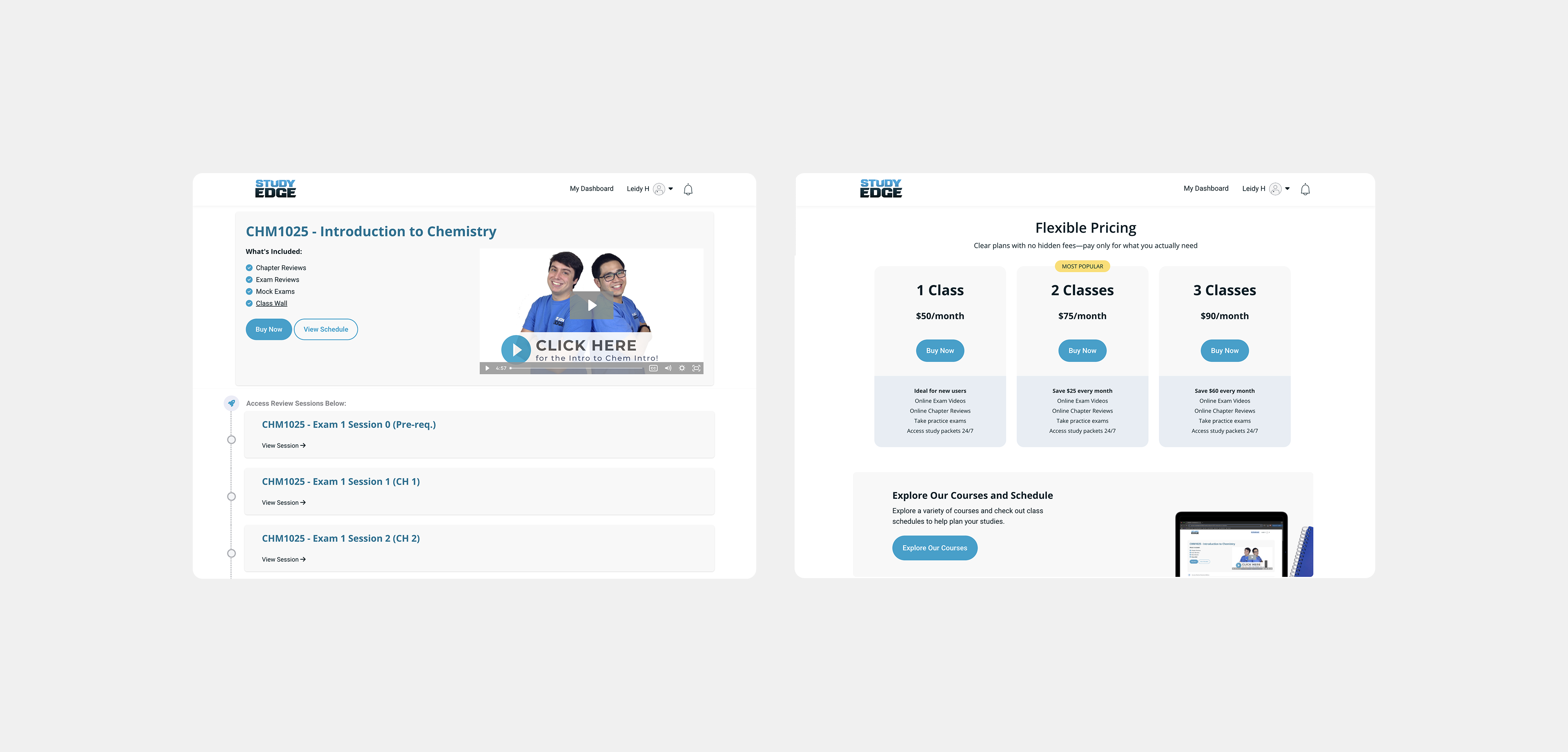
This header is a sticky component that remains anchored to the top of the page as the user scrolls. By keeping the main function of the page accessible at all times, we reduce friction and help users achieve their goals more efficiently.

Courses & Schedule

A simple and focused experience that directly addresses our users' goals

This page was intentionally designed with minimal interaction to keep the browsing experience distraction-free. Its main goal is to allow users to easily explore available courses. A clear CTA provides direct access to review the course in detail, check the schedule, and proceed with Buy Now and select the best membership

Enrollement Experience

Secure Account Management

Require Study Edge–specific accounts using university email (removing Facebook Connect), with multi-factor authentication. Enhance account and membership management to ensure security and a seamless user experience.

Takeaways

I learned to apply UI directly on a platform like Thinkific, collaborating within a Scrum methodology alongside developers, and making iterative changes based on feedback from both the client and students. This project was a great opportunity for me to put my understanding of UX design into practice, assessing and improving design decisions to create a solution that balanced user needs with business objectives.